12/27/15

How to make a pie chart in excel?

In this last post you have learnt about chart in excel. Today we will discuss about how to make a pie chart in excel? First you learn what Is pie chart? It is data that is arranged in one column or row only on row only on a worksheet can be plotted in a pie chart. Pie chart shows the size of items in one data series, proportional to the sum of the items. The data points in a pie chart are displayed as a percentage of the whole pie.

How to make a pie chart in excel?

First open your excel sheet and then enter data you will create a pie chart. For example, below image shows that select the range of the data. In this image data that represent the basic pay of employees can pie chart to emphasize the Basic pay.


When you select the range of the data go to the insert menu and you see chart group, in this group you see pie chart command press it you see many option in pie chart, select the types of chart would you like to have. For example 2-d pie and 3-d pie and many more option and press ok.


How to put image in pie chart?

When your chart is ready and you want to insert pic in a pie chart. Go to chart tools tab, go to layout option and go to current selection left on the top corner and press format selection you see format chart area box. Select the fill option.Go to picture or textile fill.


Go to insert from option and select file option and choose your pic which you want to add and ok.


If you have found any mistake or have any doubt related to above how to make a pie chart in excel tutorial then comment below.

Continue Reading →

12/20/15

Different Types of Charts in Excel.

In last post we will discuss table format. Today we will discuss about charts in excel.  It is provides the means to display the information in its workbooks graphically. You can make a pie chart, line and as you want and you can save the charts you create as templates to make the creation of subsequent charts easier. A chart is a graphical representation of date, you can also say the data is represented by symbols, such as bars in a bar chart, lines in a line chart, or slices in a pie chart. A chart can represent tabular numeric data, functions or some kinds of qualitative structure and provides different info.

Why you use charts in excel?

Charts are often used to ease understanding of large quantities of data and the relationships between parts of the data. It can usually be read more quickly than the raw data that they are produced from. They are used in a wide variety of fields, and can be created by hand or by computer using a charting application. Certain types of charts are more useful for presenting a given data set than others.

How many types of chart use in excel?

In Microsoft excel you use many types of chart:-
1. Line chart
2. Column chart
3. Bar chart
4. Area chart
5. Pie chart
6. Scatter chart
7. Bubble chart
8. Radar chart
9. Surface chart
10. Stock chart

Line chart:- It displayed the information as series of data point, its connected by straight line segment. In excel line chart used Data that is arranged in column’s or rows on a worksheet can be plotted in a line chart. Line chart can displayed can display continuous data over time, set against a common scale, and are therefore ideal for showing trends in data at equal intervals.

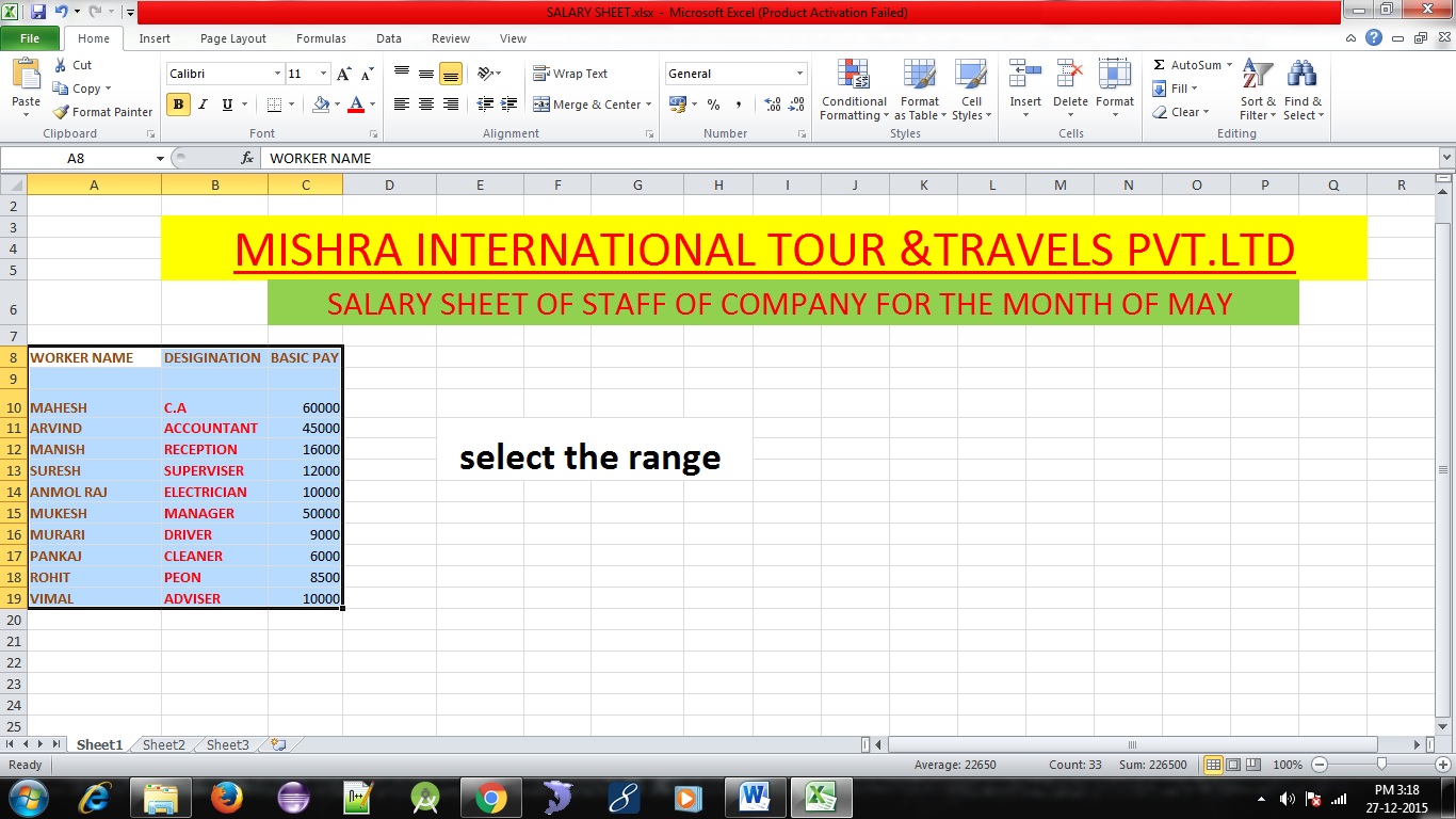
Column chart:- It displayed the graphic representation of data. It displays vertical bars going across the chart horizontally, with the values axis being displayed on the left side of the chart. In the picture below, is an example of a column chart of salaries paid of employers has received between the month of May. As can be seen in this example, you can easily see a basic salary without reading any data.


Bar chart:- It is a chart that presents Grouped data with rectangular bars with lengths proportional to the values that they represent. The bars can be plotted vertically or horizontally. A vertical bar chart is sometimes called bar chart. you can easily see a basic salary without reading any data.


Area chart:- It is arranged the data in columns or rows on a worksheet can be plotted in an area chart. Area charts emphasize the magnitude of change over time, and can be used to draw attention to the value across a trend. For example, data that represent the basic pay of employees can be plotted in an area chart to emphasize the Basic pay.

Pie chart:-  It is data that is arranged in one column or row only on row only on a worksheet can be plotted in a pie chart. Pie charts shows the size of items in one data series, proportional to the sum of the items. The data points in a pie chart are displayed as a percentage of the whole pie. For example data that represent the basic pay of employees can pie chart to emphasize the Basic pay.


Scatter chart:- It is displayed the values of two variable are plotted to axis. Data is arranged in columns and rows on an worksheet can be plotted in an scatter chart. Scatter charts show the relationship among the numberic values in several data series, or plots two groups of numbers as one series of scatter coodinates.


Bubble chart:- Its arranged in columns on a worksheet so that x values are listed in the first column and corresponding y values and bubble size values are listed in adjacent columns, can be plotted in a bubble chart. You can use a bubble chart instead of a scatter chart if your data has three data series that each contain a set of values. The sizes of the bubbles are determined by the value in the third data series.

  
Radar chart:- It is a  graphical method of displaying multivariate data in the form of two dimensional chart  of three or more quantitive variables represented on axes starting from the same point. The relative position and angle of the axes is typically uninformative. It is also known as web chart, spider chart, star chart.


Surface chart:- Surface charts display two or more data series on a surface. Surface charts are listed in the Other Charts category. It’s important to understand that a surface chart does not plot 3-D data points. The series axis for a surface chart, as with all other 3-D charts, is a category axis—not a value axis. In other words, if you have data that is represented by x, y, and z coordinates, it can’t be plotted accurately on a surface chart unless the x and y values are equally spaced.


Stock chart:- It is arranged in columns or rows in a specific order on a worksheet can be plotted in a stock chart.

If you have found any mistake or have any doubt related to above introduction to MS excel
tutorial then comment below.
Continue Reading →

12/16/15

Table format

In this tutorial you will learn about Table Format in Microsoft excel. Format as table enables you to both define an entire range of data as a table and format all its data all in one operation. After you define a cell range as a table, you can completely modify its formatting simply by clicking a new style thumbnail in the Table styles gallery. Excel also automatically extends this table definition and consequently its table formatting — to all the new rows you insert within the table and add at the bottom as well as any new columns you insert within the table or add to either the table’s left or right end.
Table format is so automatic that, to use it, you only need to position the cell pointer somewhere within the table of data prior to clicking the Table Format command button on the Home tab.

Where I found format as table in Microsoft excel?

 First you will open Microsoft excel and go to home tab you see a Style group in this group you see format as table. Below image shows that where you found format as table in Microsoft Excel?


How to apply Table Format in Microsoft excel?

1. First click the range of cell you want to format as a table.
2. Go to the Home tab, and see the styles group and click the format as table command.
3. Select the thumbnail which you want to use.
4. Click ok.

How to create format table in several ways?

In this Microsoft excel first thing to learn how to work with excel tables is to use the program to create the table. You will need a list with row heading and column heading. Select the range of the data also include the heading rows and column. When you select range you have go to Insert table and you see tables group and select Table option. Visually confirm that the range you have selected is correct or not. Click the My table has headers checkbox and press ok.
  Excel will then create a formatted table for you. If you would prefer to choose a particular table format, select the same data area and click Home(instead of Insert); then choose a table style from the Table Styles gallery.

Through this video you can easy learn table format.


If you have found any mistake or have any doubt related to above Table format tutorial then comment below.
Continue Reading →

12/14/15

How to Use Conditional Formatting Based on Another Cell?


In this tutorial we are learn about how to conditional formatting based on another cell? In this tutorial we will learn how to create different formatting rules, how to edit and copy our formatting rules in ms excel, and also how to do conditional formatting based on another cell. It is a really powerful feature when it comes to applying different formats to data that meets certain condition. It can help you highlight the most important information in your spreadsheets and identify variances of cells' values with a quick glance.
How to create conditional formatting rules?
1.      First select the range of cell which we want to create conditional formatting.
2.      Then we go to conditional formatting command and press the option we will see the drop
         down list.
3.       And select the Highlight cell rules, and select Greater than option.


4. when we select the Greater Than option we see a Greater than option as given in below image.


In this image we see, First when we want to format cell greater than 1000,so we will enter the value of 1000. He highlights the number which is greater than 1000. Same process do in all option.

Preset conditional formatting
Microsoft excel has several presets we can use to quickly apply conditional formatting to your cells. They are grouped into three categories:

1.      Data Bars
2.      Color Scales
3.      Icon set

Data Bars:- First we discuss about Data bars, Data bars are horizontal bars added to each cell, much like a bar graph.


Note:-  Its not work when we select the alphabetical cell. Its work when we select Numerical cell.

Color Scales:- Now we discuss about Color Scales, Color scales change the color of each cell based on its value. Each color scale uses a two- or three-color gradient. For example, in the  -Yellow-Red- Green  color scale, the highest values are yellow, the average values are red and the lowest values are green.


Icon set:-  Now we discuss about Icon Sets, Icon sets the change the color of each based
on its value. Each directional sign shows icons in data cells by applying desired Condition.

For Example, Red sign is low number yellow sign shows medium number and green sign shows highest number.

In above image shows that Red color show Lowest Number, yellow color shows Medium Number and Green color shows Highest Number.We also choose shapes, indicators and Ratings to show the Numbers.

For More icon set ruler, we will go to conditional formatting select Icon sets and go to more rules and press it. Now we see New formatting Rule box as image given as below.


In this image we will go to Select a Rule Type and select Format all cells based on their values the go to Edit the Rule Description and We set format all cells based on their Values as we want.
If you have found any mistake or have any doubt related to above how to conditional formatting based on another cell? tutorial then comment below. If you like the tutorial the follow on twitter and also like us on facebook.

Continue Reading →

12/11/15

The Home function of Microsoft Excel.

In this tutorial we learn about the Home function of Microsoft Excel.


Clipboard Group :- In this group we can see some command like Cut, Copy and Paste.When we using this command use remove text one area sheet to another Microsoft Excel Spreadsheet. When we use the cut option it removes the selected text after the using command we can insert the clipboard text into the new location.

Using this command we can also copy this formula text one are sheet to another Microsoft Excel Spreadsheet.


Font Group:-When we see font group, we can control the font properties of our text.  In this group we can see the drop down list to the change font type and font changes. We also see more commands just like Bold, Italic, Text underline. If we need more setting to improve wer font setting press ctrl + D and change setting as we wish.
 Original image


We can see explanation about font group in below image.


Alignment group:- Using the group, we can control the position and lawet the text in our worksheet.


Top Alignment-It aligns text to top left.
Middle Alignment- It centered the text between the top and bottom of the cell.
Bottom Alignment-it align text bottom of the left.


Align Text Left:- Using this function, we can do align text to left. Shortcut key
Align Centre:- Using this function, we can do align text to centre.
Align Text Right:- Using this function, we can do align text to right.


Decrease Indent:-  When we enter any text into the cell and after we want to indent the text on left side, each time we  click the button each time, the selected text will nudge to the left.

Use shortcut key to decrease Indent ctrl+alt+shift+tab


Increase Indent:- When we enter any text into the cell and after we want to indent the text on right side, each time we click the button each time, the selected text will nudge to the right.

Use shortcut key to Increase Indent ctrl+alt+tab

Orientation:- In this option when we rotate the cell content use orientation option and the select rotation as given in option. Angle counterclockwise, Angle clockwise, Vertical text, Rotate text up and Rotate text down.


Wrap Text:-  Wrap text is the feature that wrap the text within a cell. We can also used to described word wrap or any text that goes to the next line without pressing the enter or return key. Below image shows that how to use Wrap text?


Merge and center :- It combines two or more cells in a spreadsheet or a table into one cell, and then centres the contents of the new cell.


How to use merge and centre?
1.      First select the range of the cell, which we want to merge.

2.      Click the Home tab, and go to alignment group

3.       And press merge and centre option and we see the selected range of the cell make a new cell.

Below sheet shows how to use merge and center?


Number Format:- Now we are going to Number group in Home tab and when we see the group we see drop down list. First of all we discuss about dropdown list. When we click on drop down list in number format group then we see various option like Number, Currency, Accounting etc.

Below image shows that the Number Format drop down list.


Number:-  we see drop down list we see top of the list is Number, the number of decimal places, whether or not the thousands separator is used, and the format to be used for negative numbers.


Currency :- If we enter a financial value complete with the dollar sign and two decimal places, Excel assigns a Currency number format to the cell along with the entry.


Accounting:- The Accounting format is used for monetary values. But, this format aligns the currency symbols and decimal points of number in a column.


Long date:- Long date option convert a number into date. Such as 10-11-15 shows as  10-November-2015.


Time:- Time option convert a number into Time Format.


Percentage:- If we enter a value representing a percentage as a whole number followed by the percent sign without any decimal places, Excel assigns to the cell the Percentage number format that follows this pattern along with the entry.


Short date:- Short date option convert a number into date. Such as 10-November-2015 shows as 10-11-15.


Fraction:- Fraction option convert a number into fraction. Such as when we enter 12/15  shows as 4/5.


Increase Decimal:- In this option we already entered number in cell or worksheet, we can increase the  number of places that are displayed after the decimal point by using the Increase Decimal buttons.


 Decrease Decimal:- In this option we already entered number in cell or worksheet, we can decrease the number of places that are displayed after the decimal point by using the decrease Decimal buttons.


Use the keyboard shortcut Ctrl+1 to open the Format Cells dialog box.


Styles Group:- In this group we can see some command like Conditional formatting, Format as table and cells style.


we will learn about Style Group next tutorial.


Continue Reading →

12/2/15

Introduction to MS Excel

In this tutorial you will learn about introduction to MS excel.

MS Excel is application software. It is used for calculation and data analysis such as pivot table, analysis, goal seek & scenarios, that all made excel a powerful & useful tool. You can also insert graphs or charts and perform complex calculations. Data is stored in rows and columns format. By default excel workbook contain 3 sheets.

Various components of excel spreadsheet are illustrated below.

Title Bar :-  Its display the name of the excel spreadsheet. By default spreadsheet name is Document1 or Book1.

Menu Bar :- It is a primary function of any application. Menu Bar is a thin rectangle, which is typically located at the top of the screen and below the title bar, containing drop down menu.

Button Bar :- It is a set of multiple buttons joined into a separate control. In Button Bar every Button has a text label or icon or both.

Formula Bar :- When we use any formula in an excel spreadsheet then it is displayed in the formula bar. 

Sheet tab :-  When we open excel, we always see that excel automatically selects sheet 1 for us. If we want, we can rename, delete, move and change colour of the sheet by right clicking on it. We can also hide and protect the sheet.

Use shortcut key Alt+Shift+F1 to create a new sheet.

Name box :- It display the name of the currently selected cell. For example H6, A5, B3, etc. In H6, H is the column name an 6 is the row number.

Other Important MS Excel Information

1 Excel file = 1 Workbook = 255 sheets

Total Number of rows = 65536

Total Number of columns = 256

Total Number of cells = Rows * Columns 
65536 * 256 = 16777216 Total Cells.

Rows are numeric and columns are alphabetical.


Above image shows that we are working in excel using cell address. They are made up of the combination of rows and columns. For creating cell address, first column name and then row name is written. 

A2, H5, B2, C4, D5, these are cell addresses. A is Column and 2 is Row. All type of calculations are performed using cell address. Cell address can be viewed in Name box.

If you have found any mistake or have any doubt related to above introduction to MS excel tutorial then comment below.
Continue Reading →

Follow on Twitter

Linkedin

Categories

Mad About Computer. Powered by Blogger.
This site is in no way affiliated with or endorsed by specified business. It exists as a compendium of supporting information intended for informational purposes only. If you want to buy this website, please don't hesitate to contact us via e-mail: denacc977 @ gmail (dot) com or you can find and buy it on Afternic domain auctions.